Booking software for salons: a site that shows it from the inside
A site for a product, not a service. Here we had to sell a program nobody has seen yet, so the center of the page is three working screens: the client card, the report for the week and the reminders to clients. Next to them the plans, with a “by the month or by the year” switch and the discount already figured out.
Nobody buys software from a list,
they buy it once they have seen it working.
So the three screens stand above the list of what it can do, and the trial period does not ask for a card.
- Three working screensA client card, a report for the week and a reminder in Viber. Not abstract icons but what the administrator will be looking at every day.
- Six things it can doOnline booking, reminders, a client record, staff pay, inventory, reports from a phone. Each one described in a single paragraph.
- Plans with a switchThree plans, paid by the month or by the year. The switch changes the prices at once, and the discount is written as a number.
- Moving over from the old programExport, transfer, training, a week of running both side by side. This is the main fear, and it has a section of its own.
- Questions before getting startedWhat if the internet goes down, is any equipment needed, what to do about the software cash register, who owns the data.
- The trial periodSign up for 14 days without a card. The shortest way from the page to the first launch.
The screenshots are taken
from the live site.
First screen
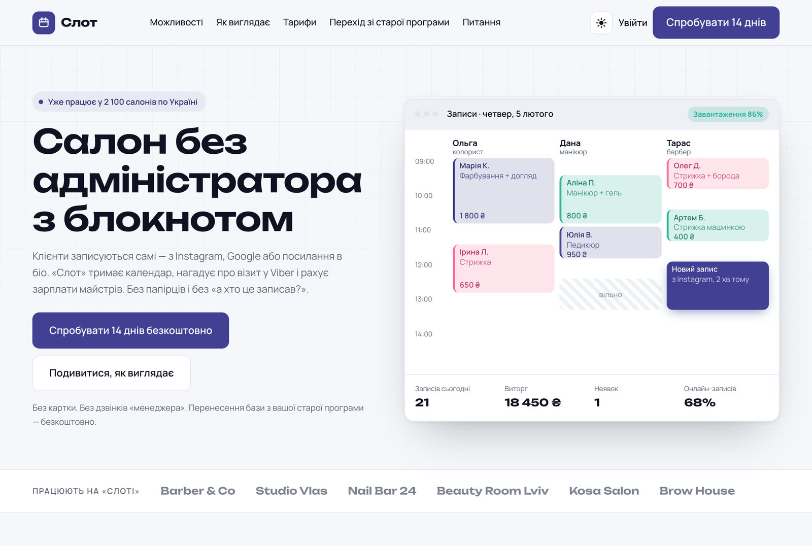
The program's window across the full width: a whole working day at a three-chair salon, with the revenue and the no-shows at the bottom. The product is visible before the first scroll.
What it looks like from the inside
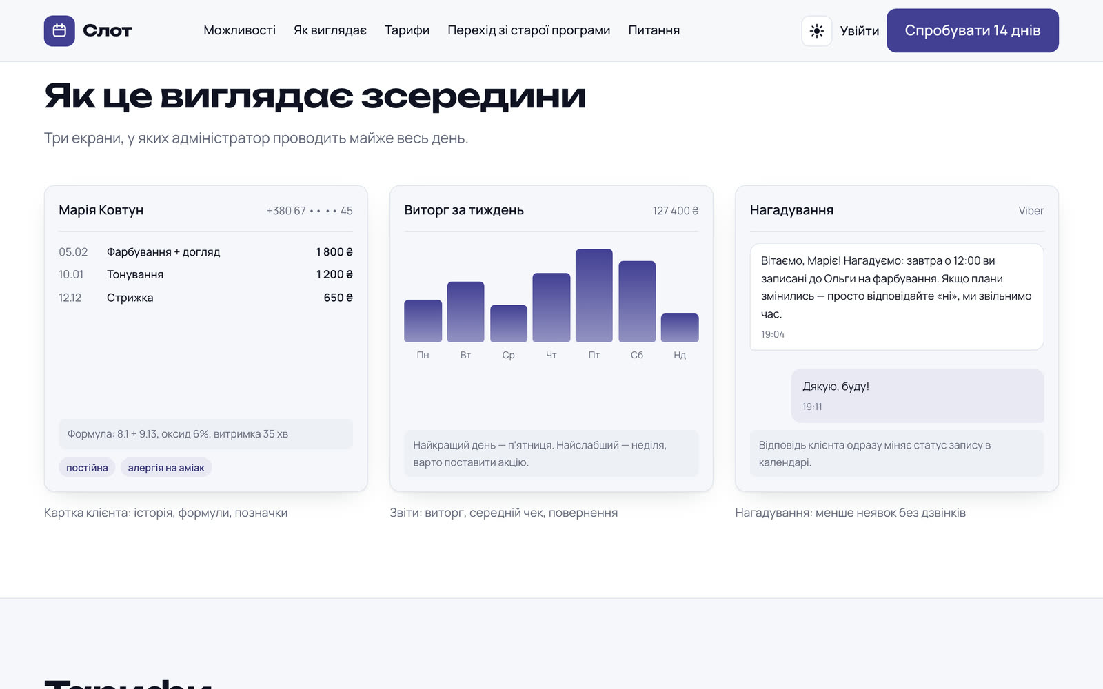
Three screens side by side: a client card, the revenue for the week and a reminder to a client. Under each one a caption saying what is happening on it.
On a phone
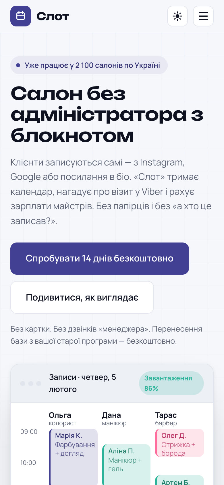
On a narrow screen the shots of the program stack one under another and stay readable. So do the plans: the prices do not run together into a heap.
Software is not bought from a description,
it is bought once people have seen it.
Three working screens right away
The client card, the report for the week and the reminders to clients are shown as they look in use. A person understands the product without installing it.
The plan is visible before sign-up
The “by the month or by the year” switch stands right on the page. Nobody fills in a form to find out the price.
A trial period with no card
The biggest barrier between curiosity and trying something is being asked for a card. Here there is none.
In the first three months after launch there were 40–50% more trial sign-ups.
We can do the same for your product
A program, a service, an app — anything that has to be shown before it is bought. Write and tell us what your product is and who you sell it to.